

Bitcoin’s transparency makes it a fascinating asset to analyse. Every transaction, wallet movement, and network trend is visible on-chain, allowing analysts to study investor behaviour with a level of precision impossible in traditional markets.
Yet this same transparency creates an overwhelming flood of information. Analysts, traders, and miners often find themselves surrounded by hundreds of charts claiming to predict the next market top. The truth is more nuanced: no single chart or indicator can time a Bitcoin cycle peak with precision.
Instead, the best approach is to combine different types of data: on-chain valuation metrics, moving-average models, ETF and flow-based indicators, and sentiment gauges. Each provides a unique lens on market dynamics; together, they offer a multidimensional map of where we stand in the cycle.
Important Note: None of these indicators predict cycle tops with certainty. They provide probabilistic context rather than precise forecasts, and become most meaningful when several signals begin to align at once.
On-Chain Market Indicators
For institutional allocators, these metrics help identify shifts in market regimes and assess when speculative activity begins to dominate long-term holder behaviour.
On-chain market indicators use Bitcoin’s transparent ledger to calculate metrics such as the average cost basis of investors, the share of holders in profit, and whether coins are moving toward or away from exchanges. These indicators visualize the psychology of holders in data form. Profit taking and long-term conviction show up as patterns in the blockchain itself.
Analysts rely on these tools to identify overvaluation zones or distribution phases, periods when long-term holders start selling to new entrants. Because they’re based on realized transaction data rather than price alone, they offer a deeper look at investor behaviour. However, on-chain indicators are best used directionally, as structural changes in liquidity, derivatives, and ETF flows can distort historical patterns.
MVRV Z-Score
Compares market value to realized value. MVRV Z-Score identifies periods where Bitcoin is extremely over or undervalued relative to its 'fair value'. A very high Z-score means prices have extended far above the aggregated cost basis of holders, historically signalling euphoric market behaviour. Periods when the Z-score (orange line) entered the pink box have indicated the top of market cycles in the past.
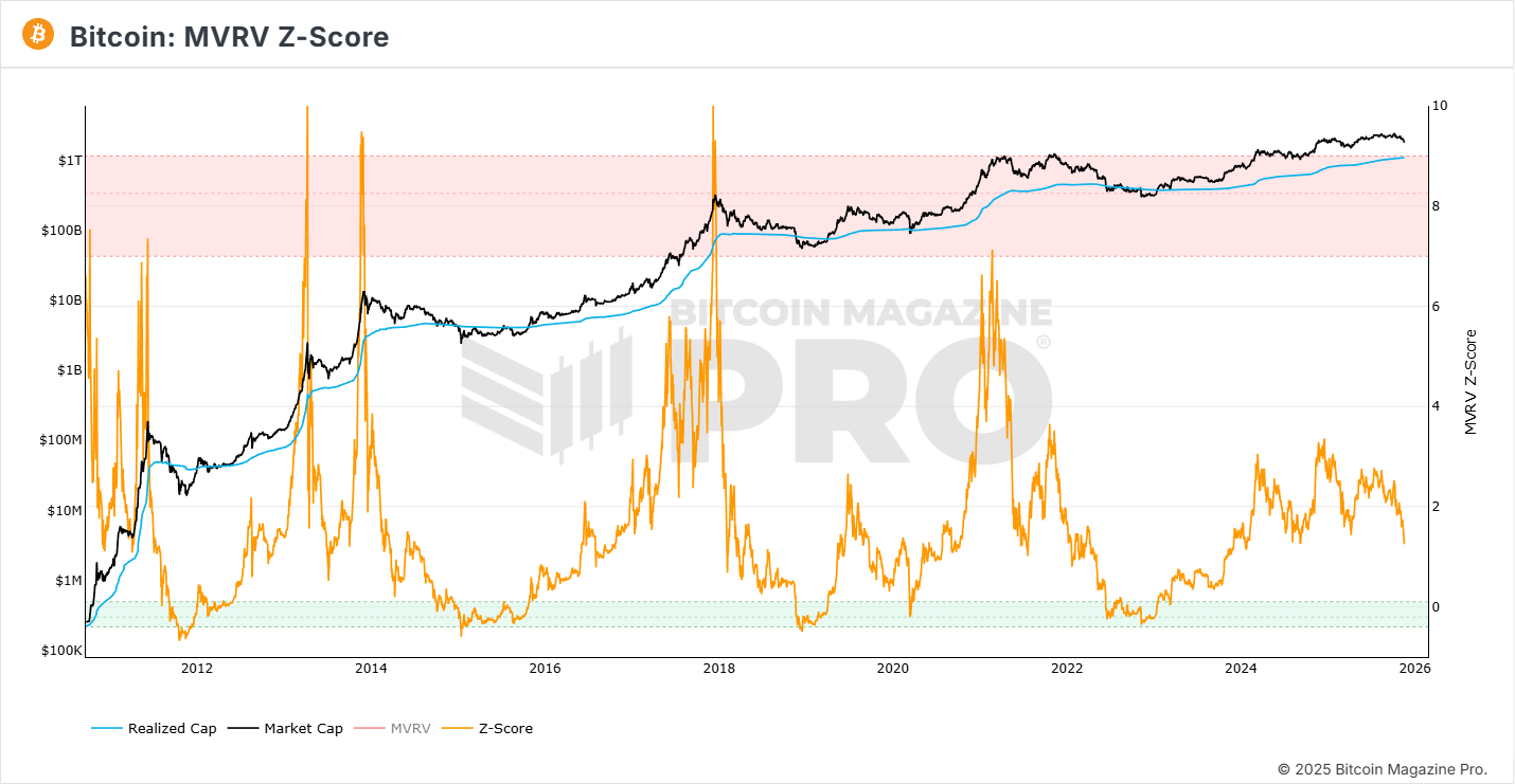
Source: Bitcoin Magazine Pro
Net Unrealized Profit/Loss (NUPL)
NUPL measures the total unrealized profit or loss across all Bitcoin holders. It’s derived from two key metrics:
- Market Value: The current Bitcoin price multiplied by total supply (similar to market cap).
- Realized Value: The value of each coin based on the price when it last moved on-chain, averaged across the network.
The difference between these two gives Unrealized Profit/Loss, and dividing that by Market Value yields NUPL.
NUPL tracks investor sentiment through cycles. When the market value rises much faster than realized value, it signals that most holders are deep in profit, a stage typically associated with euphoria and highly extended market conditions. Historically, such conditions have presented ideal moments for strategic investors to reduce exposure.
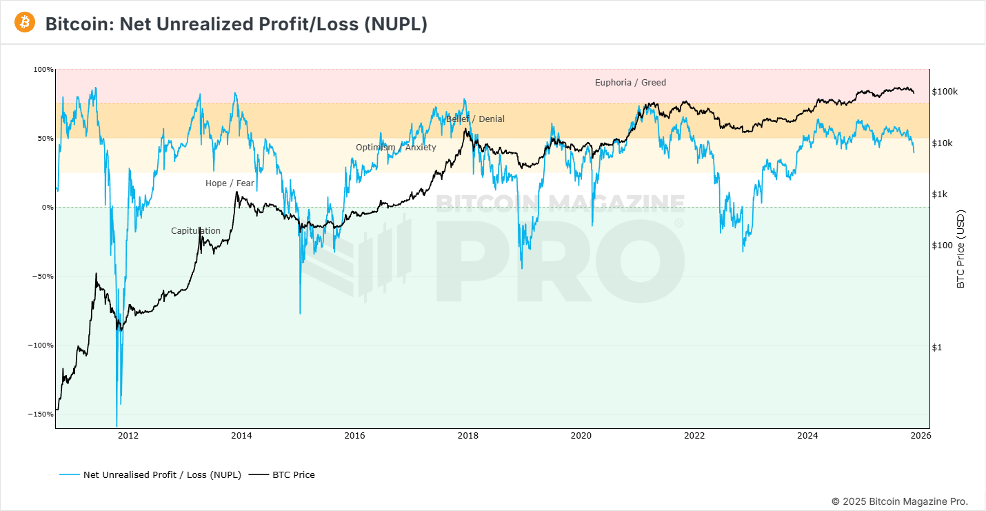
Source: Bitcoin Magazine Pro
Puell Multiple
This indicator examines Bitcoin’s supply side by analysing miner revenue. Miners are often considered systematic sellers since they must liquidate part of their earnings to cover fixed costs in a volatile market, making their revenue patterns a useful lens for understanding cycles.
The Puell Multiple is calculated by dividing the daily USD value of newly issued bitcoins by its 365-day moving average. When miner revenue is significantly above historical norms (red zone), it signals overheated conditions that have historically aligned with market tops. Conversely, low revenue periods (green zone) often occur near market bottoms, marking attractive accumulation opportunities for long-term investors.
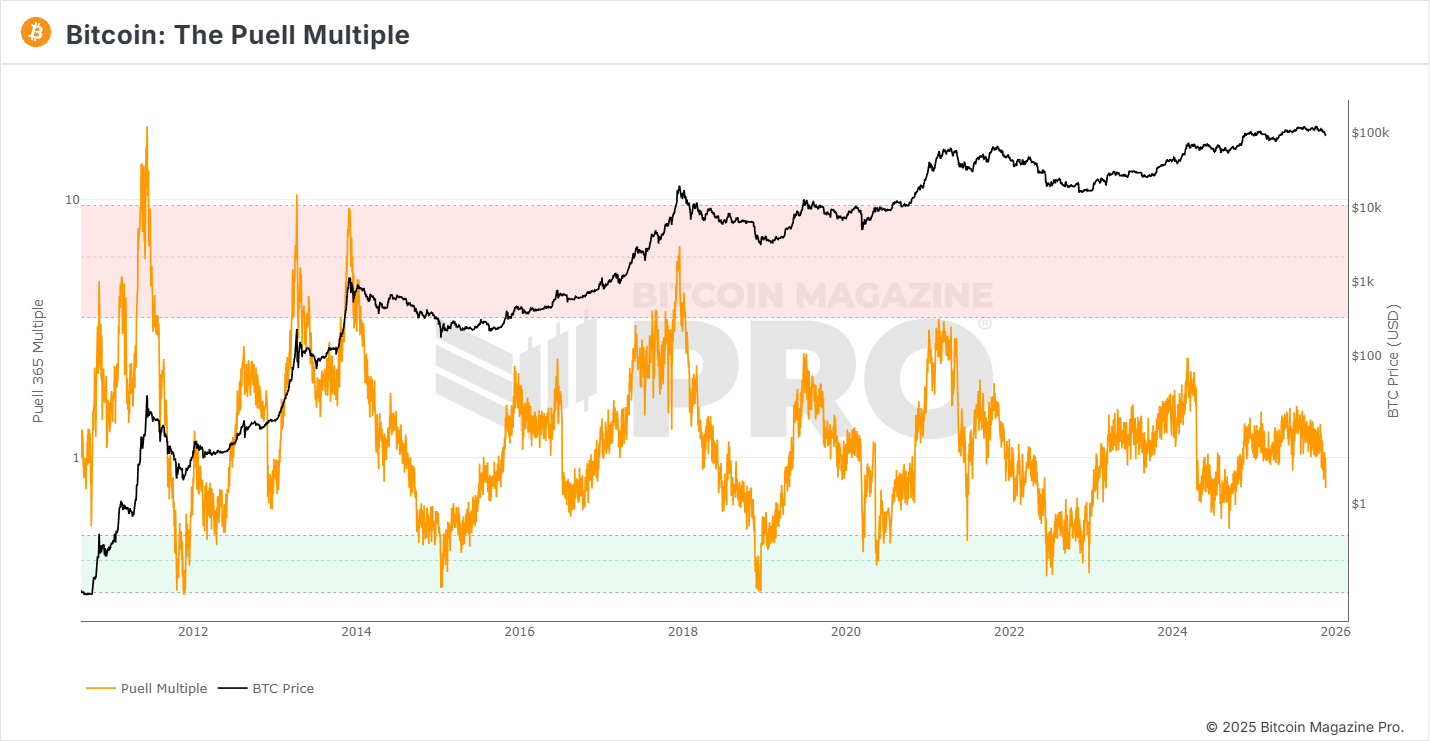
Source: Bitcoin Magazine Pro
On-chain indicators turn raw blockchain data into behavioral insight. When multiple of these metrics flash “extreme,” the probability of a macro top increases substantially.
Moving Averages and Trend Models
These models help distinguish between sustainable trend formation and overheated price extensions, which is critical for disciplined institutional risk management.
Moving averages smooth out price volatility and reveal long-term market structure. In Bitcoin’s case, they help identify trend exhaustion, how far price has stretched above its historical mean. Moving averages are also very useful to identify a shift in markets from bull to bear phases.
Traders and analysts look for the relationship between short- and long-term moving averages. Crossovers and deviations can suggest that momentum is overheating. For cycle analysis, these models act as structural markers rather than day-to-day trading signals.
50-, 100-, and 200-Day Simple Moving Averages (SMA)
Simple Moving Averages (SMAs) are among the most widely used tools in technical analysis. They smooth out short-term price fluctuations to reveal the underlying trend in Bitcoin’s market behaviour. Each SMA represents the average closing price over a specific time period:
- 50-day SMA: Reflects short-term momentum and trader sentiment.
- 100-day SMA: Captures medium-term trend direction.
- 200-day SMA: Represents the long-term market structure and is often viewed as the line dividing bull and bear markets.
When plotted together, the direction and spacing of these lines reveal market strength: upward-sloping averages suggest a sustained uptrend, while downward-sloping ones indicate weakening momentum.
Crossovers between these averages often signal key turning points. A Golden Cross occurs when a shorter-term average (typically the 50-day) crosses above a longer-term average (such as the 200-day), signalling the start of a potential bull phase. A Death Cross happens when the shorter-term average crosses below the longer-term one, often marking the onset of a broader downtrend.
For Bitcoin investors and miners alike, these moving averages provide a simple framework for identifying broader trend direction, confirming momentum shifts, and distinguishing between temporary rallies and structural reversals.
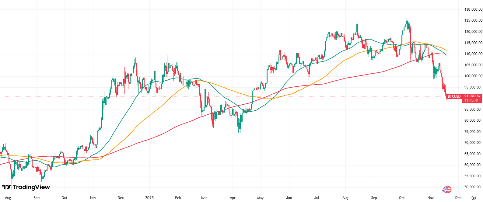
Source: TradingView
2-Year MA Multiplier
The 2-Year Moving Average (MA) Multiplier is a long-term Bitcoin valuation tool designed to highlight optimal buying and profit-taking zones throughout market cycles.
It uses two moving averages. The 2-Year MA (green line) is a baseline reflecting Bitcoin’s long-term trend. The 2-Year MA × 5 (red line) is a multiple of that average representing overextended market conditions.
Historically, Bitcoin has been undervalued when trading below the 2-Year MA and overheated when approaching the 2-Year MA × 5. Accumulating below the green line and taking profits near the red line has consistently produced strong long-term results.
The indicator captures Bitcoin’s recurring emotional cycles from fear-driven undervaluation to greed-driven overvaluation, providing investors with a simple framework to identify when price is historically low, high, or neutral.
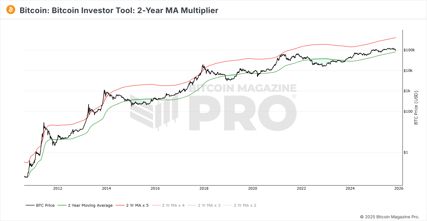
Source: Bitcoin Magazine Pro
Pi Cycle Top Indicator
The Pi Cycle Top Indicator has historically been one of the most accurate tools for identifying Bitcoin market cycle peaks, often within just a few days of the top. It’s based on two moving averages: The 111-day MA (111 DMA) and Twice the 350-day MA (350 DMA × 2).
When the 111 DMA crosses above the 350 DMA × 2, Bitcoin has historically reached a major price peak. The ratio between these averages is 350 / 111 ≈ 3.15, close to π (3.142), inspired the indicator’s name and reflects Bitcoin’s cyclical price behaviour over time.
This model highlights moments when the market becomes extremely overheated, as short-term momentum far exceeds long-term trend strength. In past cycles, these crossovers have marked ideal points to take profit. While it has worked reliably during Bitcoin’s early adoption phase, its accuracy may evolve over time as institutional participation, liquidity depth, and ETF-driven flows reshape market structure.
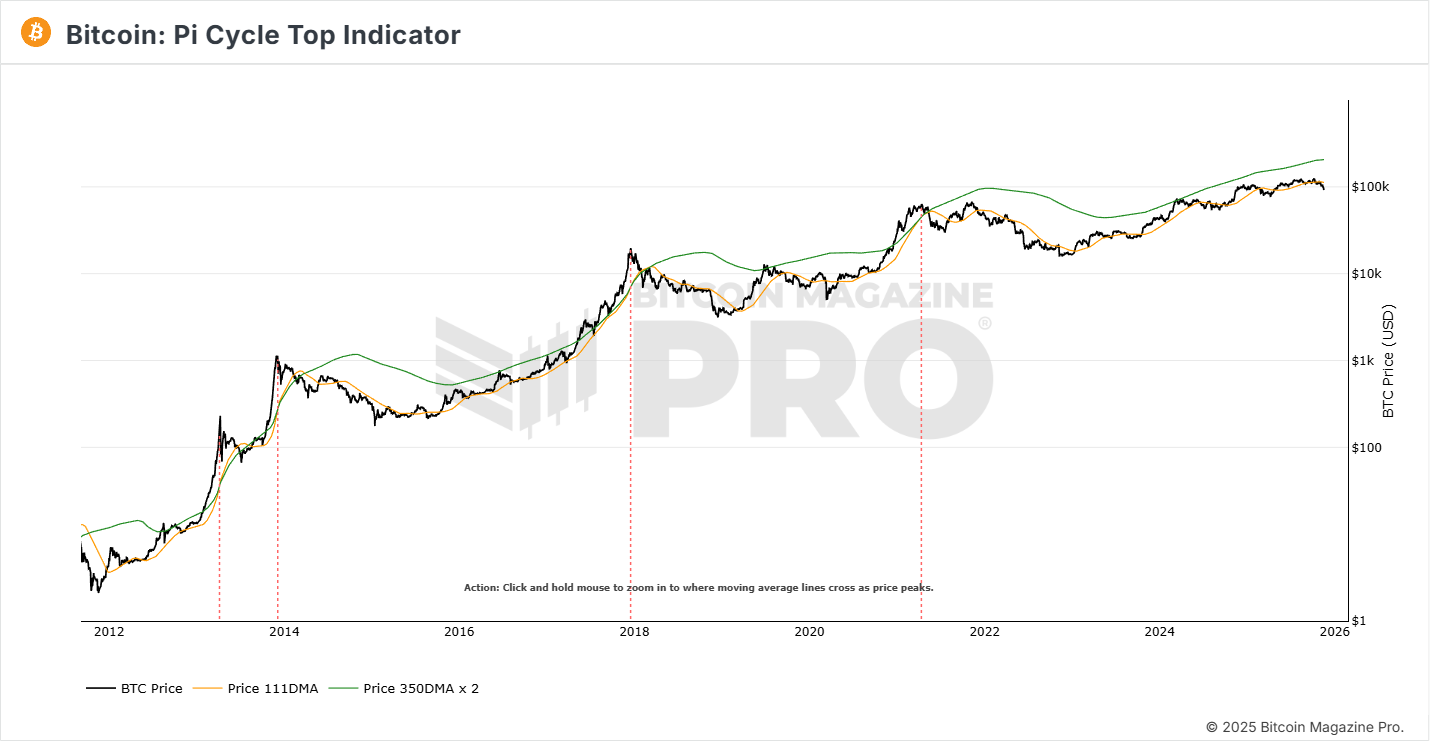
Source: Bitcoin Magazine Pro
Moving averages reflect market consensus over time. When price accelerates far above its long-term baseline, new buyers are entering at increasingly unstable levels — a dynamic that often precedes sharp reversals.
As ETF flows, institutional rebalancing, and algorithmic trading increasingly influence Bitcoin's price dynamics, the historical precision of the Pi Cycle Top may moderate over time.
ETF Flows and On-Chain Movement Charts
In the ETF era, institutional participation has become a dominant force in Bitcoin price discovery. ETF flow data net inflows or outflows from products like BlackRock’s IBIT or Grayscale’s GBTC serves as a real-time gauge of capital entering or leaving the asset. When paired with on-chain movement charts, this reveals how traditional and crypto-native capital interact.
ETF Net Flow Charts
Flow data has become one of the most important real-time indicators for institutions, because ETFs now represent a significant share of marginal demand.
A Bitcoin exchange-traded fund (ETF) is a financial product that allows investors to gain exposure to Bitcoin without directly holding the asset. Unlike the crypto market, which trades 24/7, ETFs follow traditional market hours and are subject to stock exchange trading schedules. Consistent inflows into Bitcoin ETFs typically indicate strong demand, while sharp reversals, particularly several consecutive outflow days following sustained inflows, have sometimes aligned with local exhaustion points. ETF-driven flows now represent a significant share of marginal buy pressure, meaning reversals in ETF demand can increasingly influence short-term market structure.
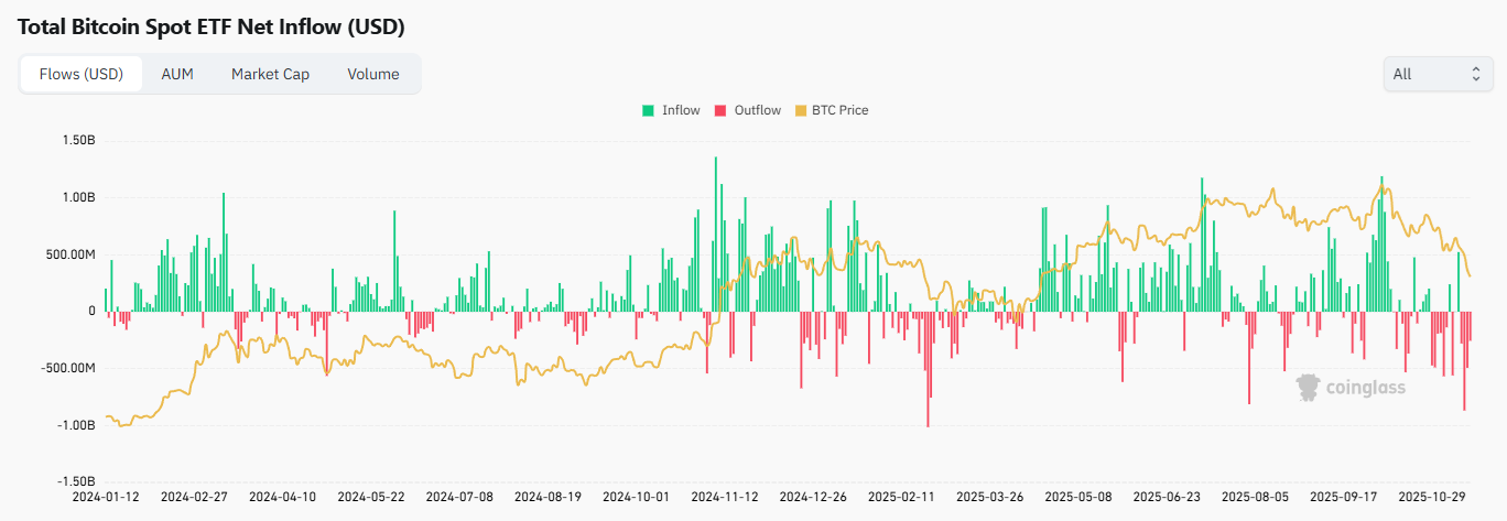
Source: CoinGlass
Exchange Reserve Metrics
Track the total amount of Bitcoin held on exchanges. Declining exchange reserves typically signal accumulation, as investors move coins to self-custody for long-term holding. Rising reserves, on the other hand, suggest increasing sell pressure, as more coins become available for trading. In general, higher Bitcoin reserves have correlated with weaker price trends. The opposite holds true for stablecoins, when exchange balances rise, it often indicates fresh buying power entering the market.
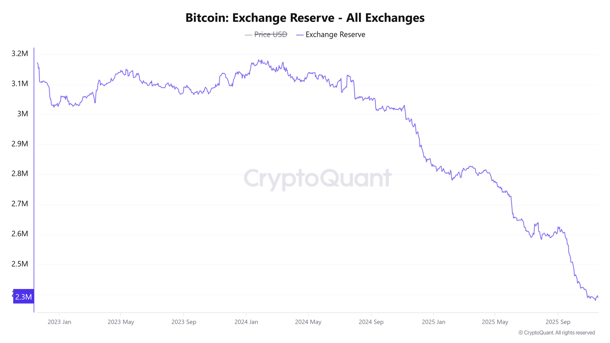
Source: CryptoQuant
Long-Term Holder Supply
This metric tracks the share of Bitcoin’s circulating supply held by long-term holders, wallets that have kept their coins for 155 days or more.
Rising long-term holder supply indicates strong conviction and accumulation, as investors are choosing to hold rather than sell. Declining levels suggest distribution, often as seasoned holders realize profits into rising demand during bullish phases. Best used to gauge market confidence and identify accumulation or distribution trends among experienced investors.
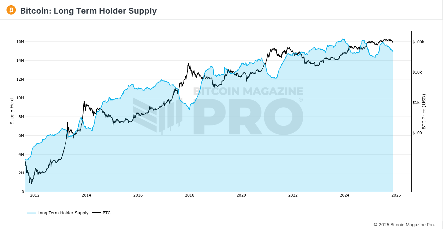
Source: Bitcoin Magazine Pro
Combining ETF and on-chain flow data connects the dots between traditional finance capital flows and native crypto liquidity. It helps analysts see whether Bitcoin’s price action is supported by real demand or simply by speculative churn.
Sentiment Indicators and Behavioural Charts
These sentiment measures help gauge when markets transition from constructive accumulation to euphoric excess, which is an important signal for treasury managers and risk desks.
Markets are driven by emotion as much as by fundamentals. Sentiment indicators quantify collective psychology using data from social media, Google searches, surveys, and derivatives positioning. In Bitcoin’s history, market peaks consistently align with extreme optimism, when everyone believes the price can only go higher.
Sentiment tools act as contrarian indicators: when greed and excitement dominate, risk tends to rise. Conversely, when fear is rampant, long-term opportunity often increases.
Fear and Greed Index
The Fear and Greed Index measures overall market sentiment in Bitcoin. It gauges whether investors are acting out of fear (undervaluation and panic) or greed (overvaluation and euphoria).
Scores range from 0 to 100, color-coded from red (extreme fear) to green (extreme greed). Extreme fear often signals that investors are overly pessimistic, historically a good time to accumulate. Extreme greed suggests excessive optimism and potential market overheating, often marking good profit-taking opportunities.
For investors, this index serves as both a contrarian signal and an emotional management tool. It helps separate personal sentiment from crowd behaviour and improves decision-making when used alongside on-chain and technical indicators.
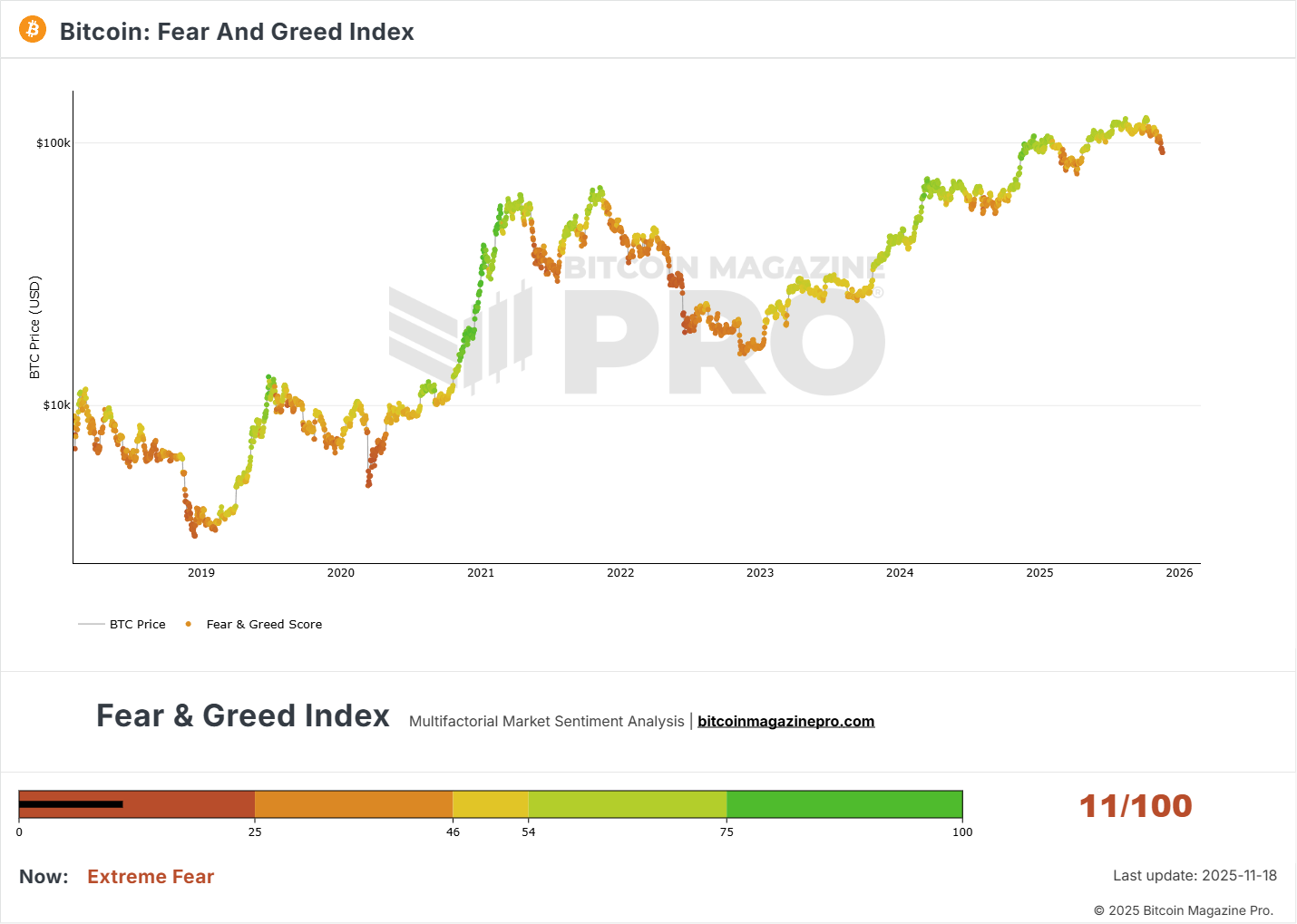
Source: Bitcoin Magazine Pro
Google Trends — “Buy Bitcoin” Search VolumeGoogle Trends data tracks how often people search for terms like “Buy Bitcoin,” offering insight into retail investor interest. sharp spikes in search volume typically appear during periods of heightened retail participation and media attention, often aligning with market tops when retail investors rush in late to the cycle.
While rising search interest reflects growing adoption over the long term, extreme surges have historically signalled short-term euphoria and potential overvaluation. This Google Trends data is best used as a contrarian sentiment signal, high public attention often marks overheated market conditions.
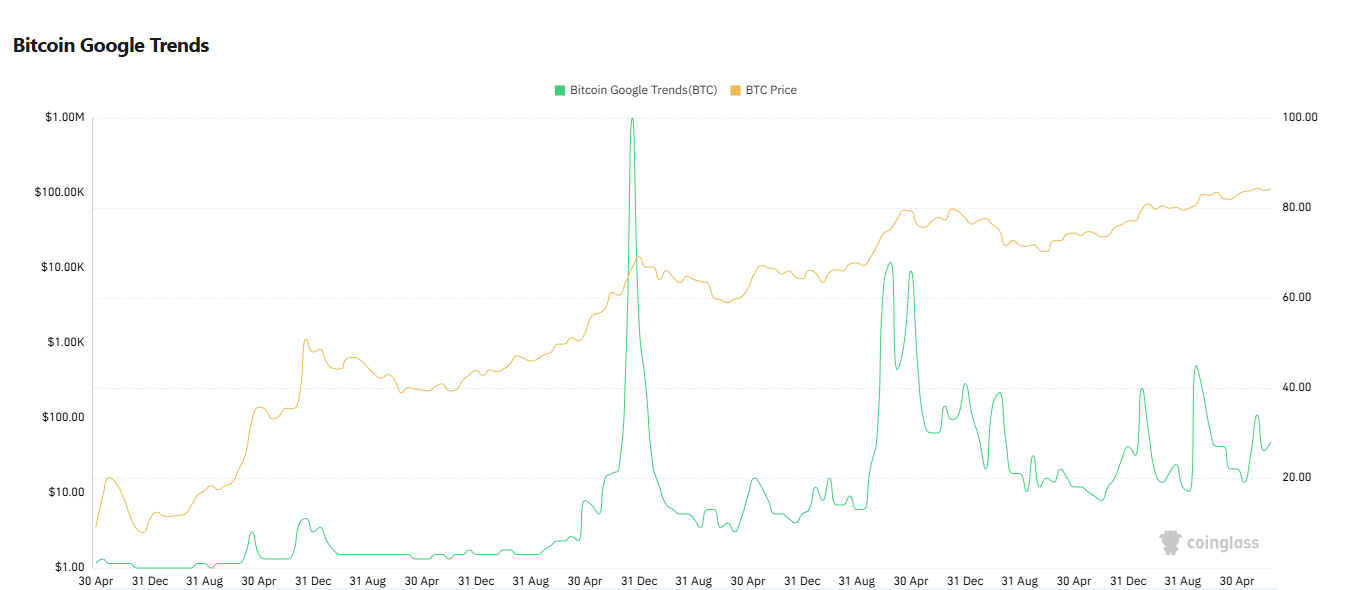
Source: CoinGlass
Bitcoin Dominance
Bitcoin dominance measures Bitcoin’s share of the total cryptocurrency market capitalization. It’s calculated by dividing Bitcoin’s market cap by the combined market cap of all cryptoassets, including altcoins, tokens, and stablecoins.
Because Bitcoin was the first and remains the largest digital asset, its dominance reflects how much capital is concentrated in BTC versus the broader crypto market. Historically, declining dominance often signals that capital is rotating into altcoins, typically during late-cycle speculative phases and retail euphoria. Sustained drops in BTC dominance alongside extreme bullish sentiment have frequently coincided with macro market tops. Best used to identify shifts in market leadership and speculative excess during late-stage bull cycles.
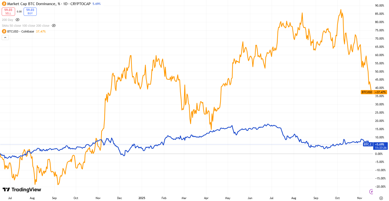
Source: TradingView
Sentiment tells you who is buying. Early in cycles, it’s patient capital and long-term believers. Near the top, it’s retail FOMO and short-term speculators, the final wave before exhaustion.
Final Thoughts
Market cycle tops are rarely defined by a single chart or model. They emerge when several dimensions, including on-chain behaviour, trend indicators, ETF flow patterns, and sentiment, begin to converge. Bitcoin offers a level of transparency that traditional asset classes lack, enabling more robust multi-factor analysis. As Bitcoin matures, institutional flows and ETF rebalancing cycles may further influence how tops form, making multi-metric analysis increasingly important. When several indicators begin flashing simultaneously, the probability of market exhaustion increases, and disciplined risk management becomes essential for allocators, miners, and treasury managers.
Nico Smid – Research Analyst GoMining Institutional